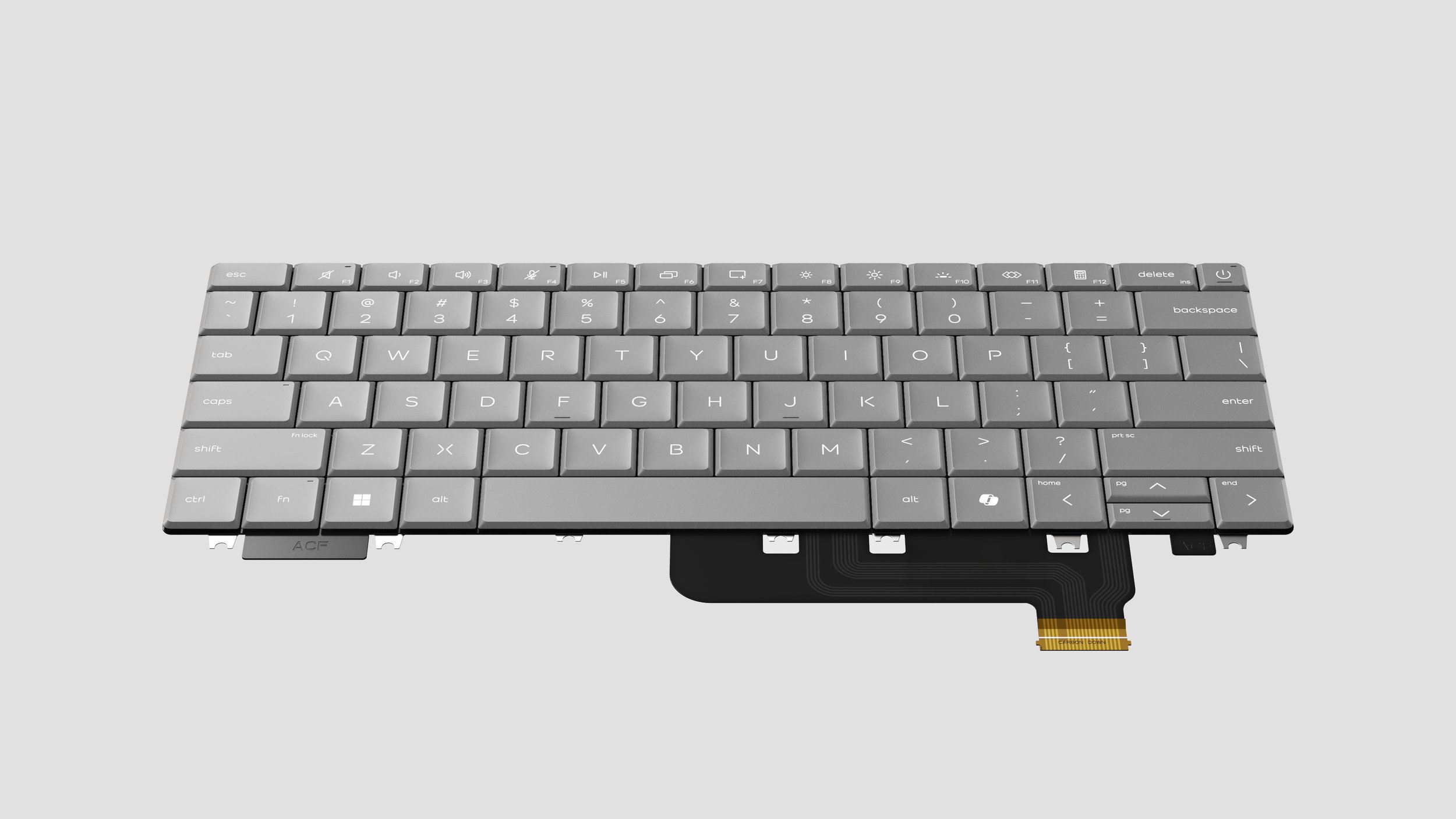
HP Latticeless Keyboard Design
ID Lead: Dennis Tsai (Consumer), Heesang Kil (Commercial), Josh Little (Desktop)
Execution Lead: Jeffrey Liu, Magic Chen, Hsiyang Hsieh
Human Factor: Andrew Wismer, Eric Thomas
Icon Design: HP UI/UX Team
Production Spring 2026
ABOUT
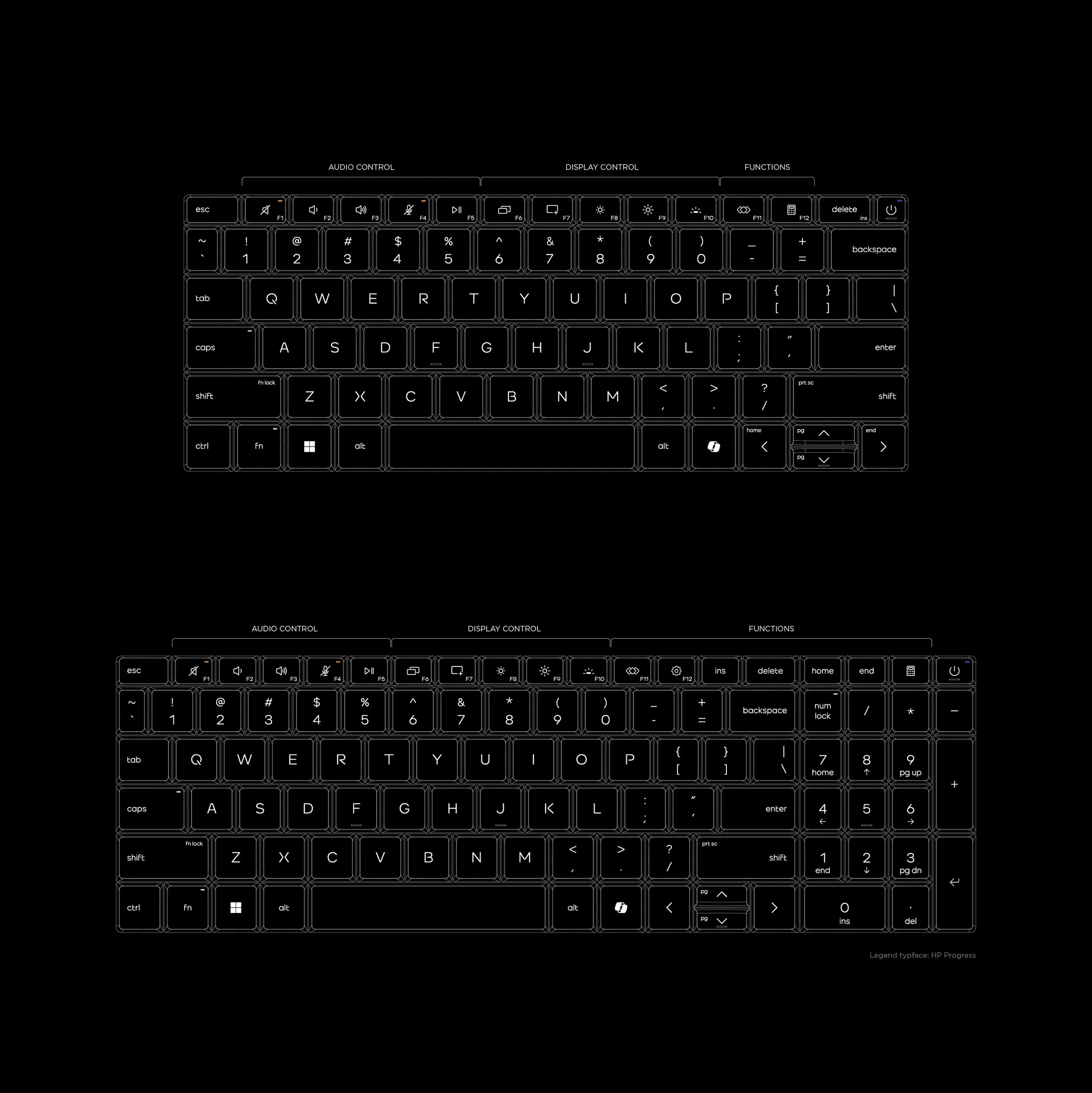
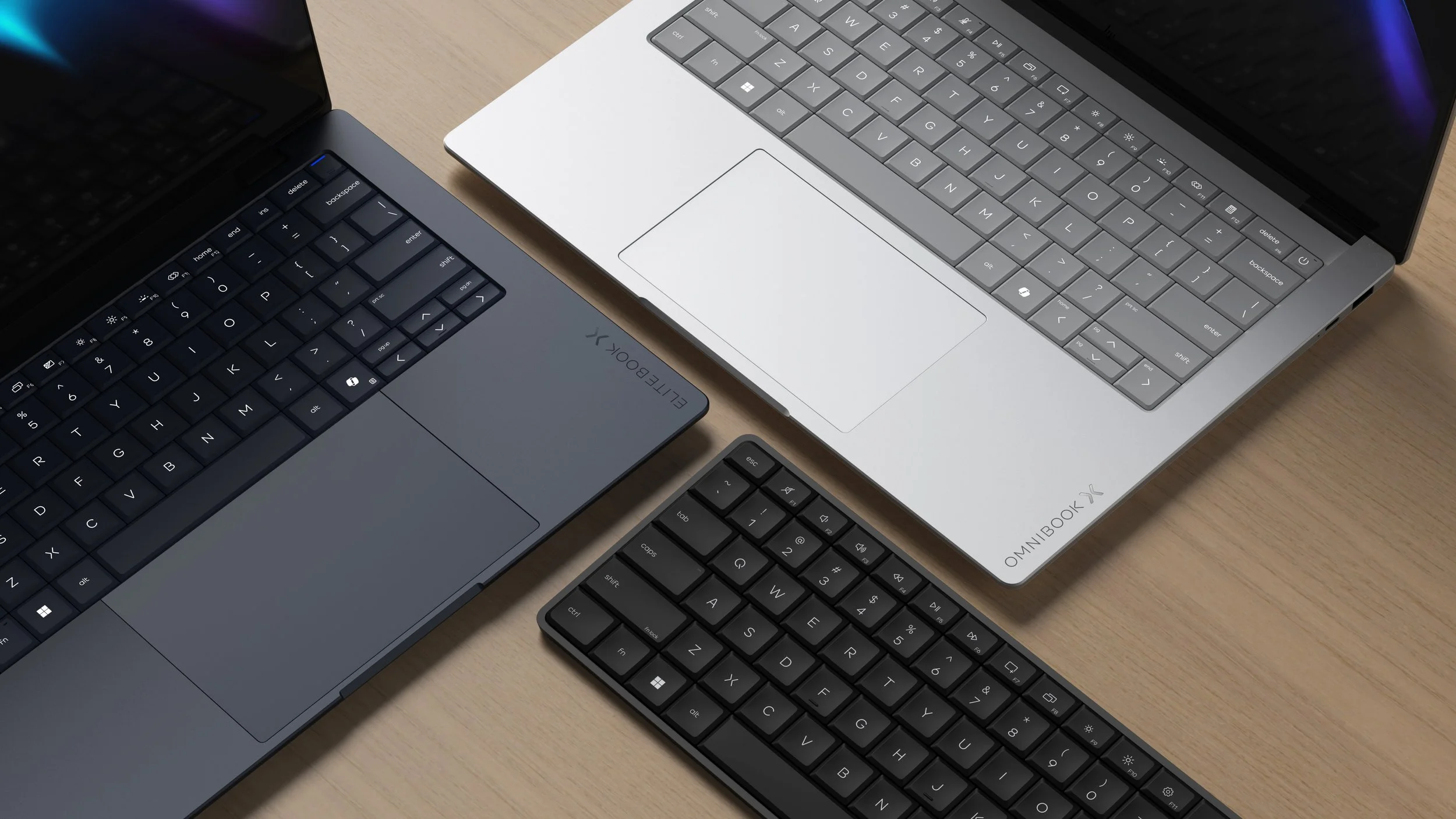
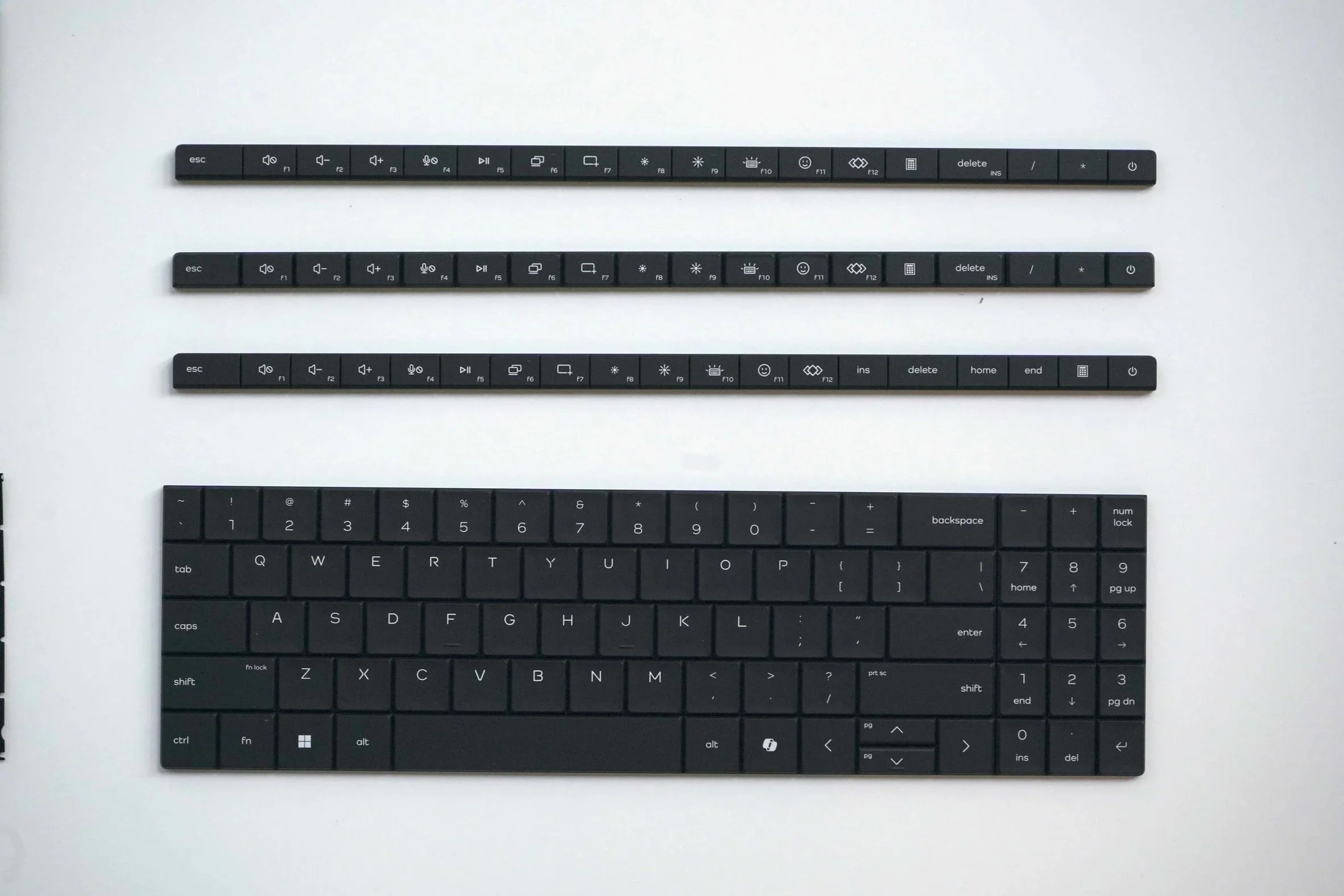
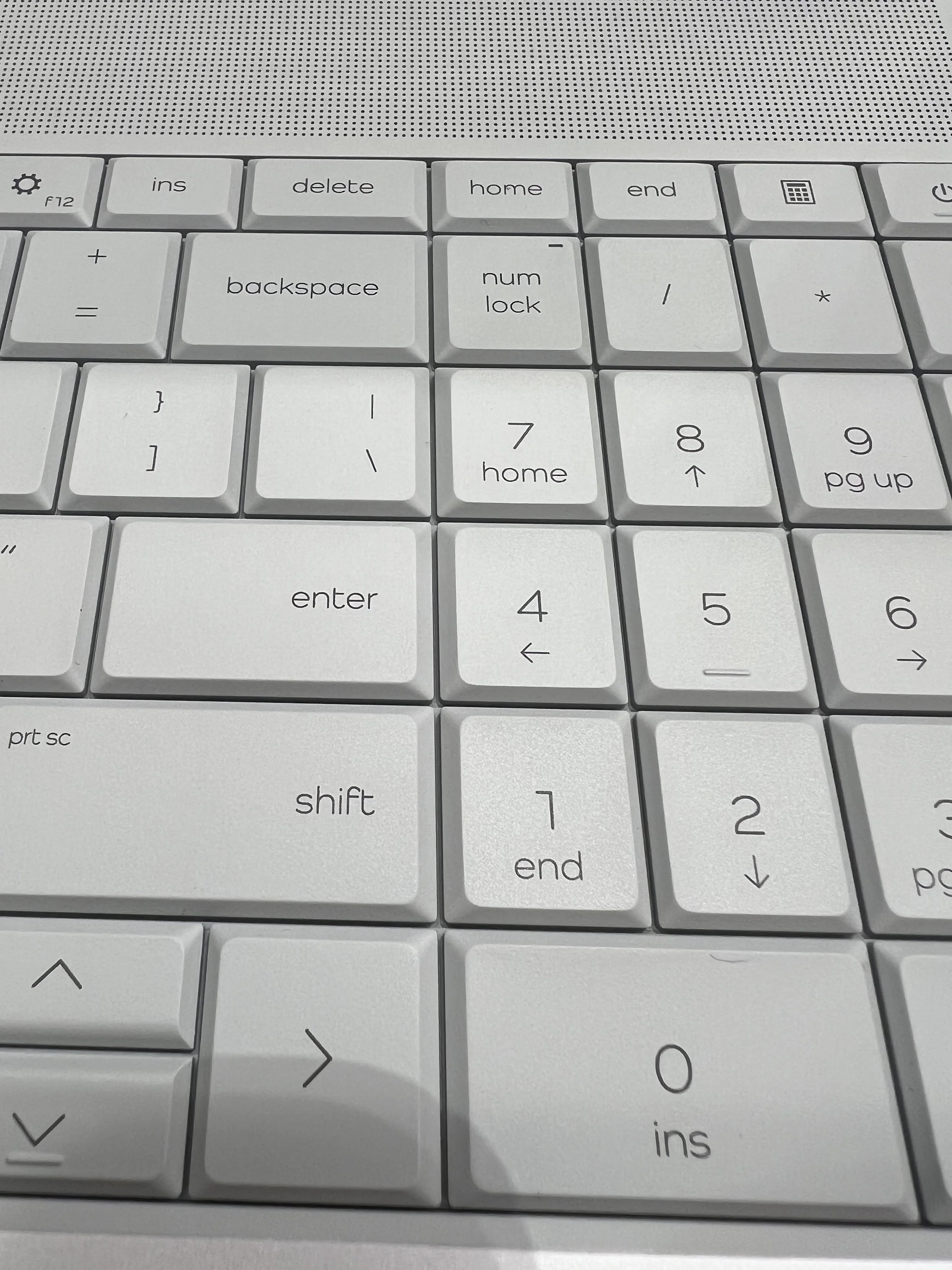
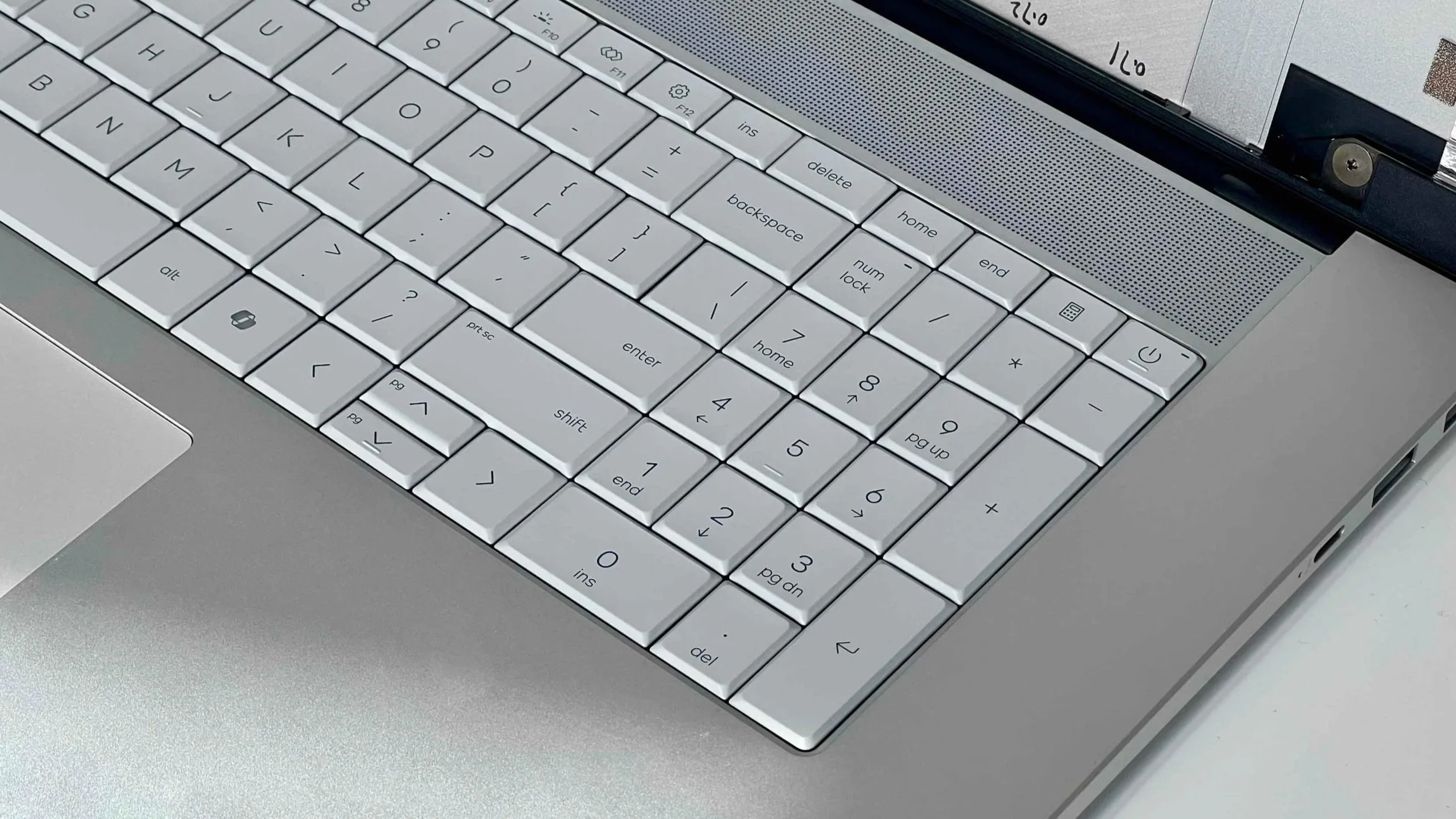
This new keyboard design language for HP’s premium PC lineup introduces a unique experience and iconic elements we believe that would be meaningful to users and business need in the next 5+ years. Thoughtfully designed key spacing and pitch, a refined key dish for pinpoint accuracy, and a new, contemporary typeface make every keystroke effortless and legible.
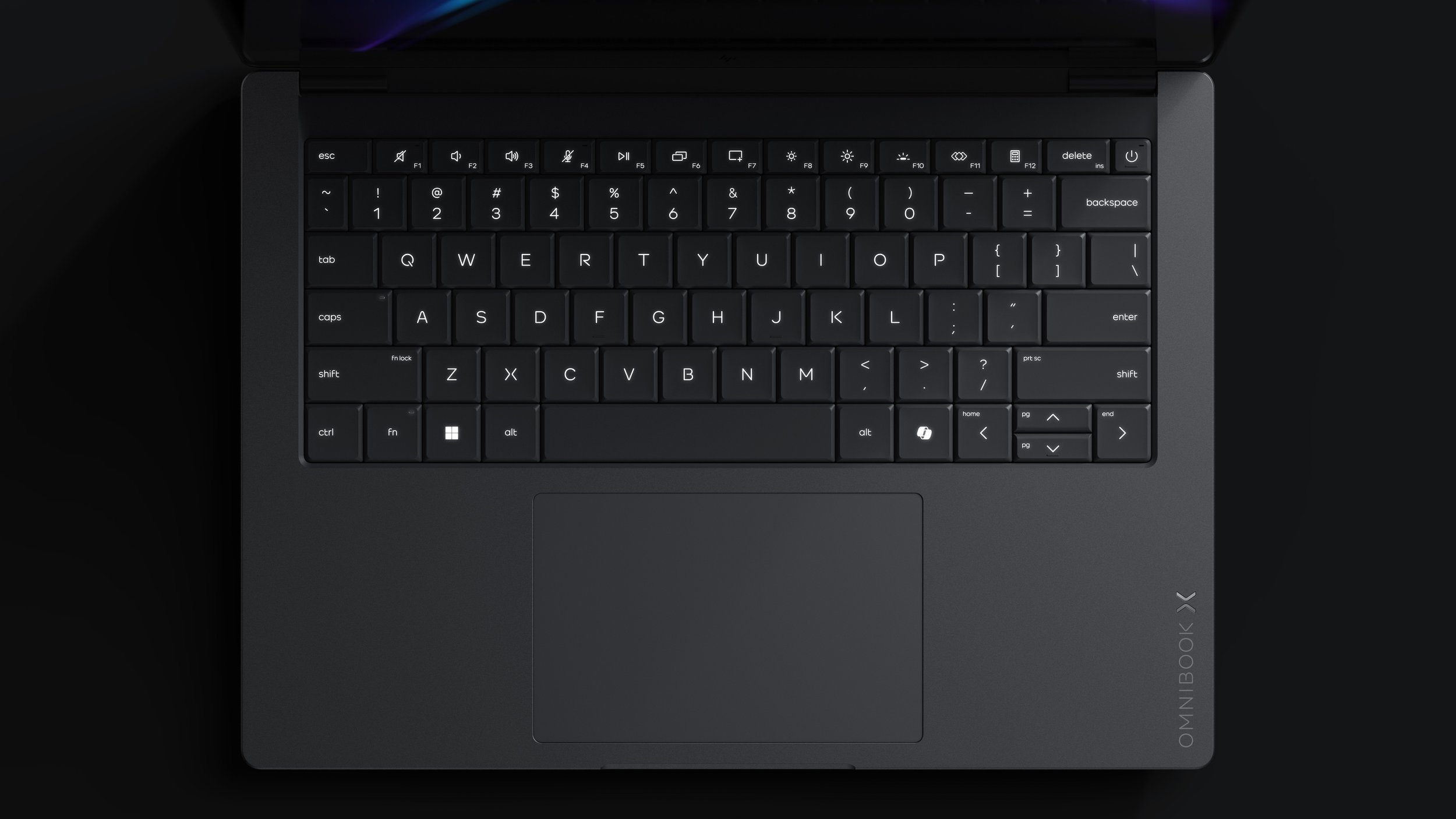
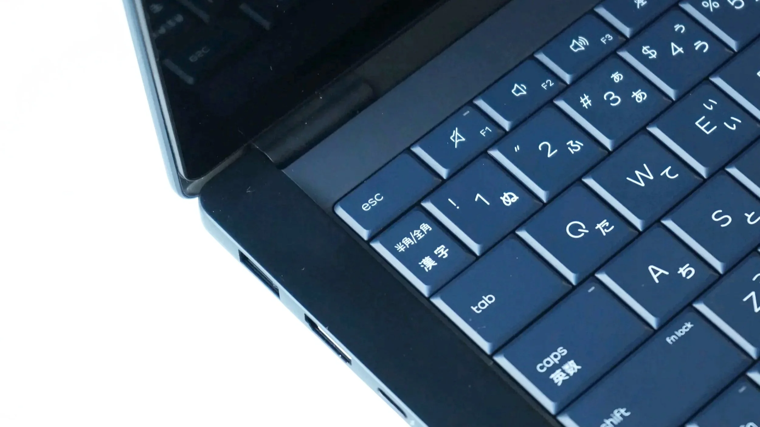
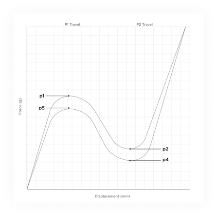
“Keyboard has a satisfying amount of travel, and it felt very natural to use, unlike the lattice-free design on Dell's XPS 14 and 16. I breezed through typing this review on the Omnibook X without any complaint.”
Engadget 8.17.26
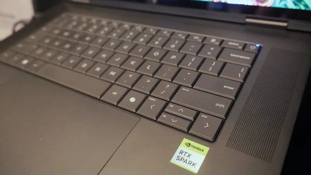
“…that’s not the real champion feature here. That belongs to the keyboard, which elevated this machine to the top of the list…the well defined keys and travel make it feel almost mechanical-like.”
Tom’s Guide 8.31.26 (Image Credit: Future)
PROCESS
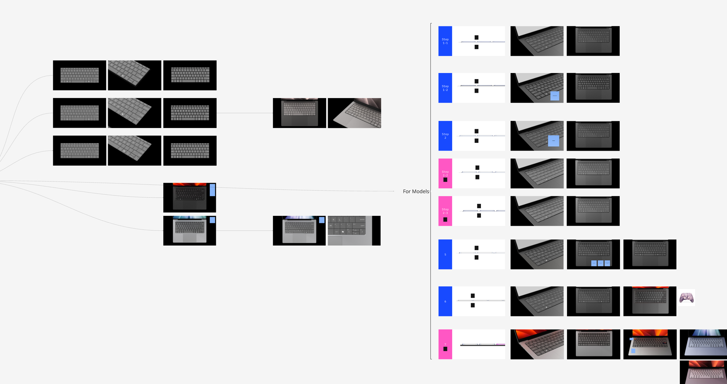
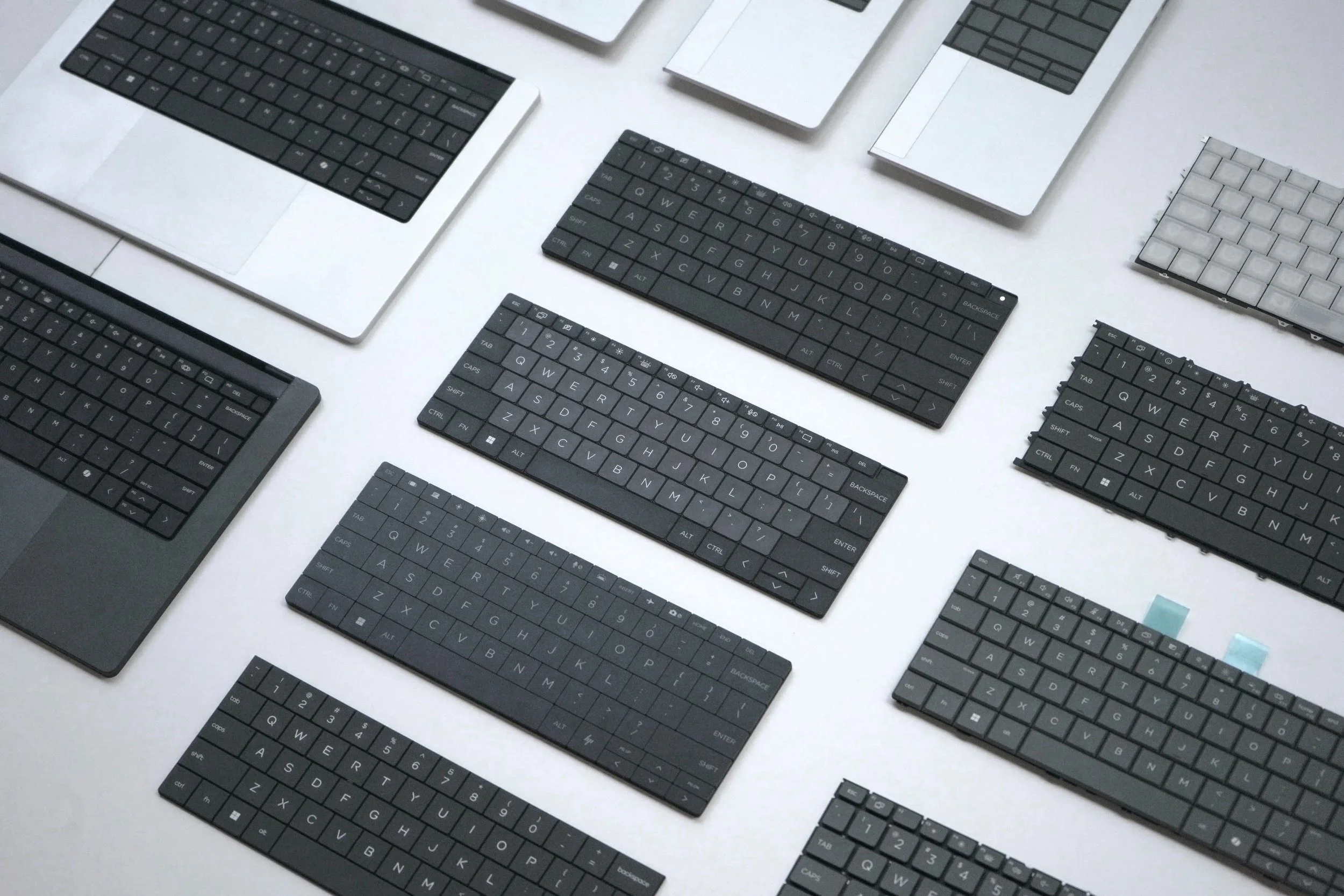
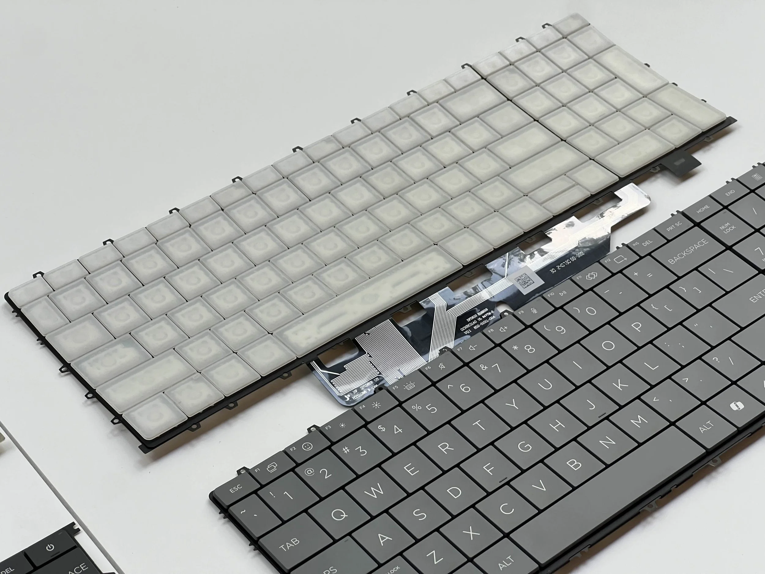
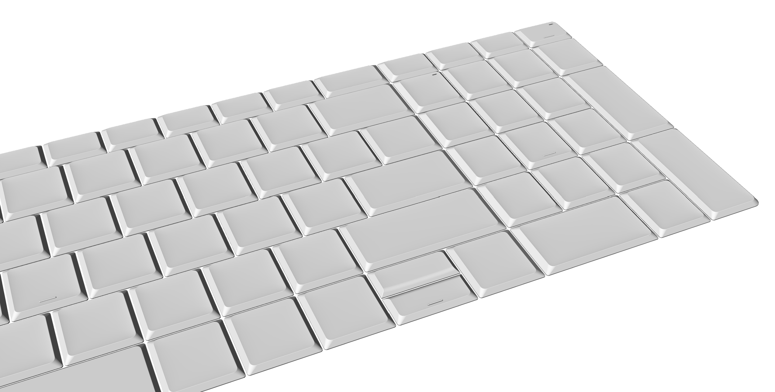
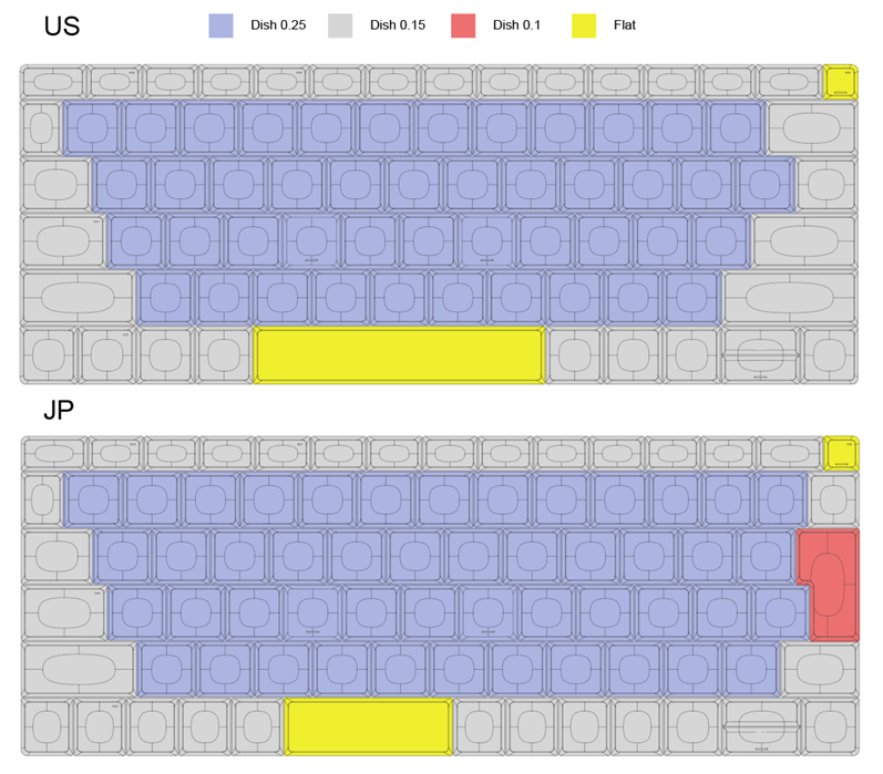
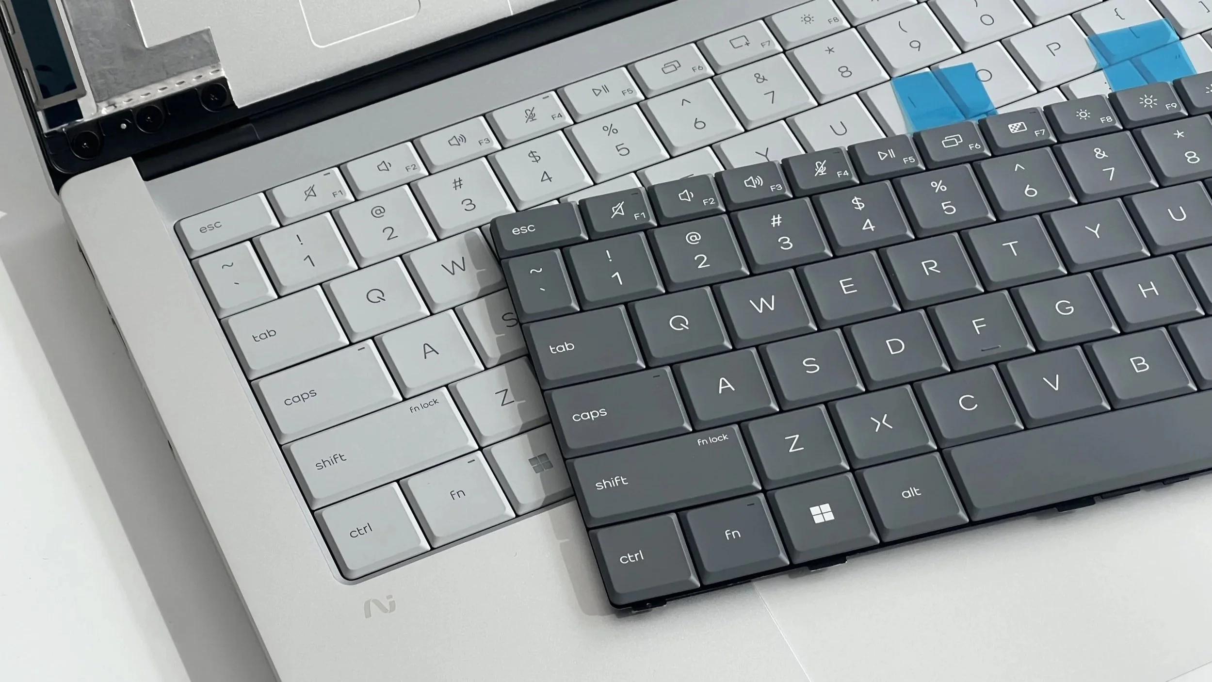
The team explored various key shapes in concept phase. Later with intensive human factor testing and close collaboration with keyboard suppliers in creating functional prototype, we concluded the final design that is distinct yet scalable across consumer and commercial notebooks, and desktop keyboards.
Not only did the keyboard provided on-shelf differentiation with its unique geometry, the choice of going for a latticeless design also reduces chassis complexity and improve serviceability.
DETAILS
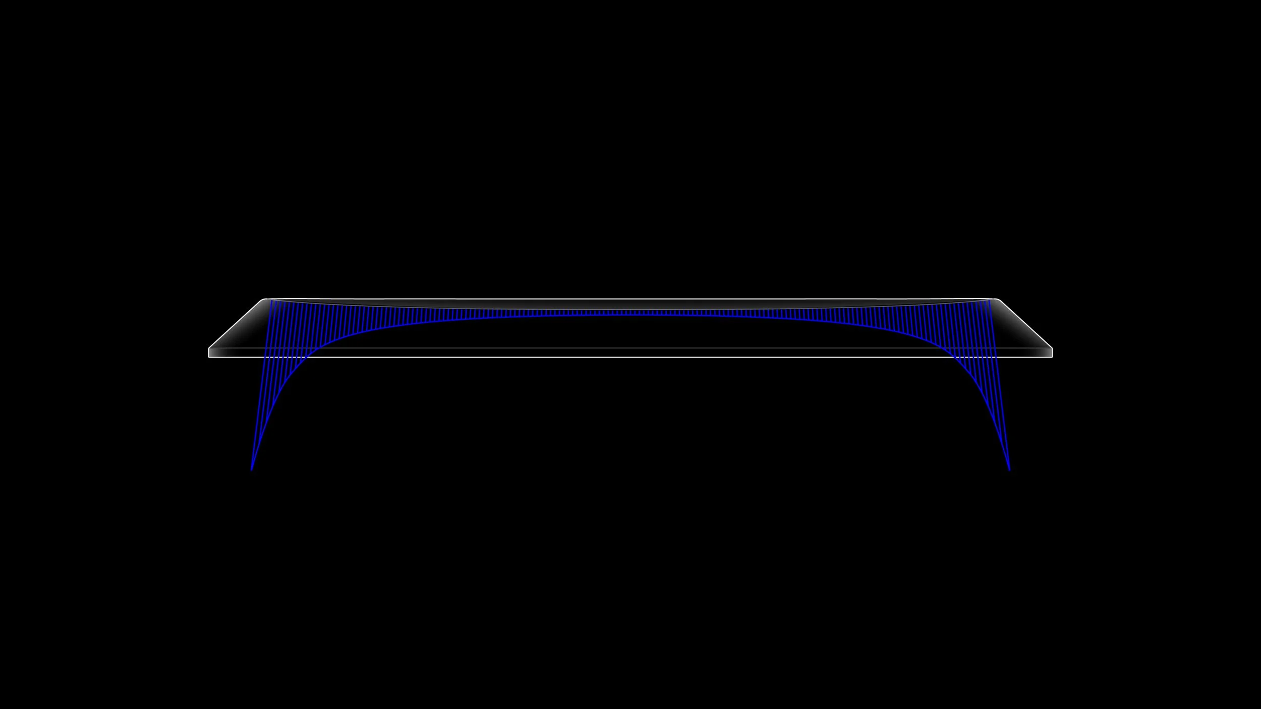
The carefully crafted keycap dish curvature is designed to maximize typing accuracy. A special coating is also applied to create an ultra smooth surface for comfortable skin feel.
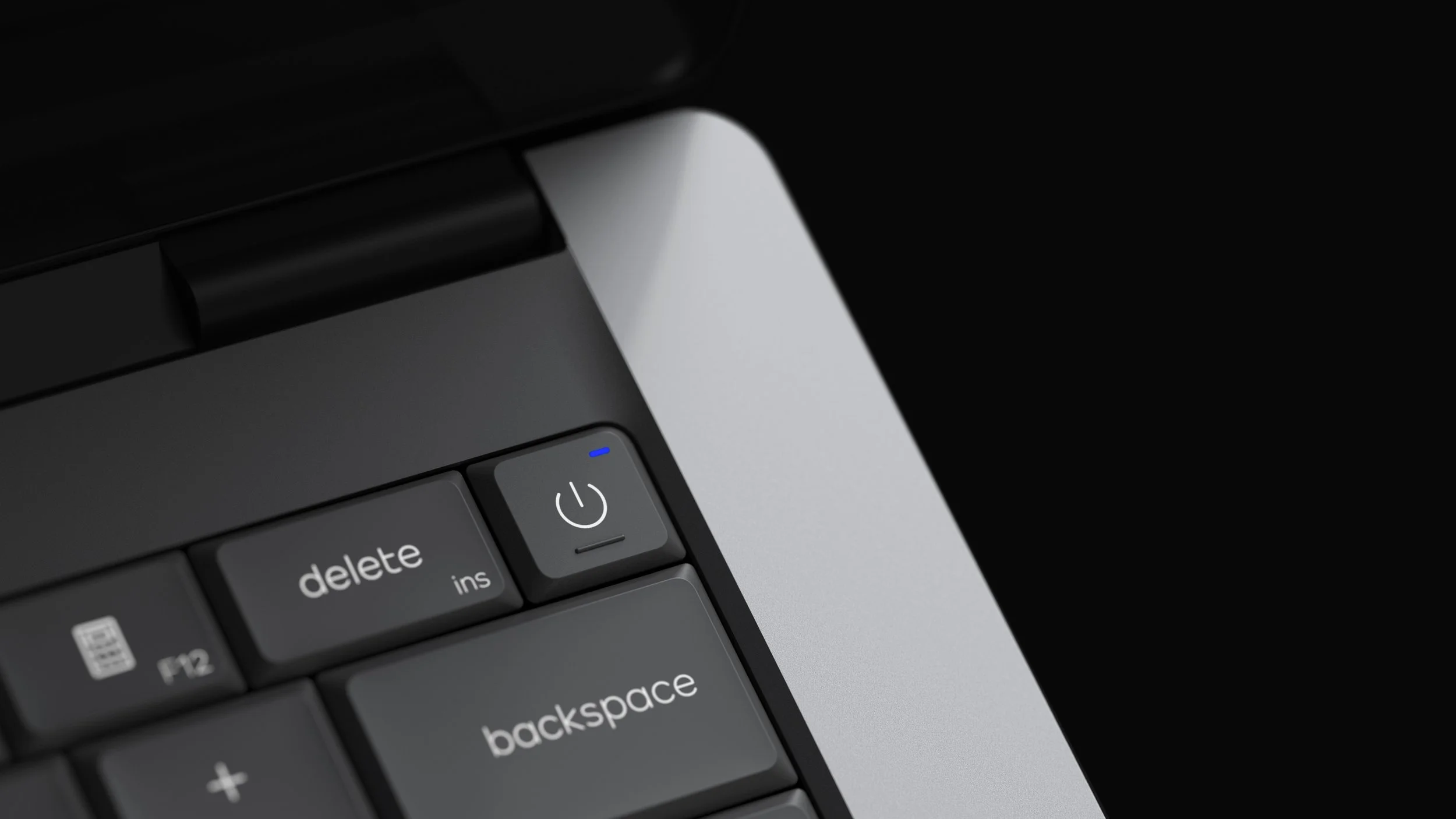
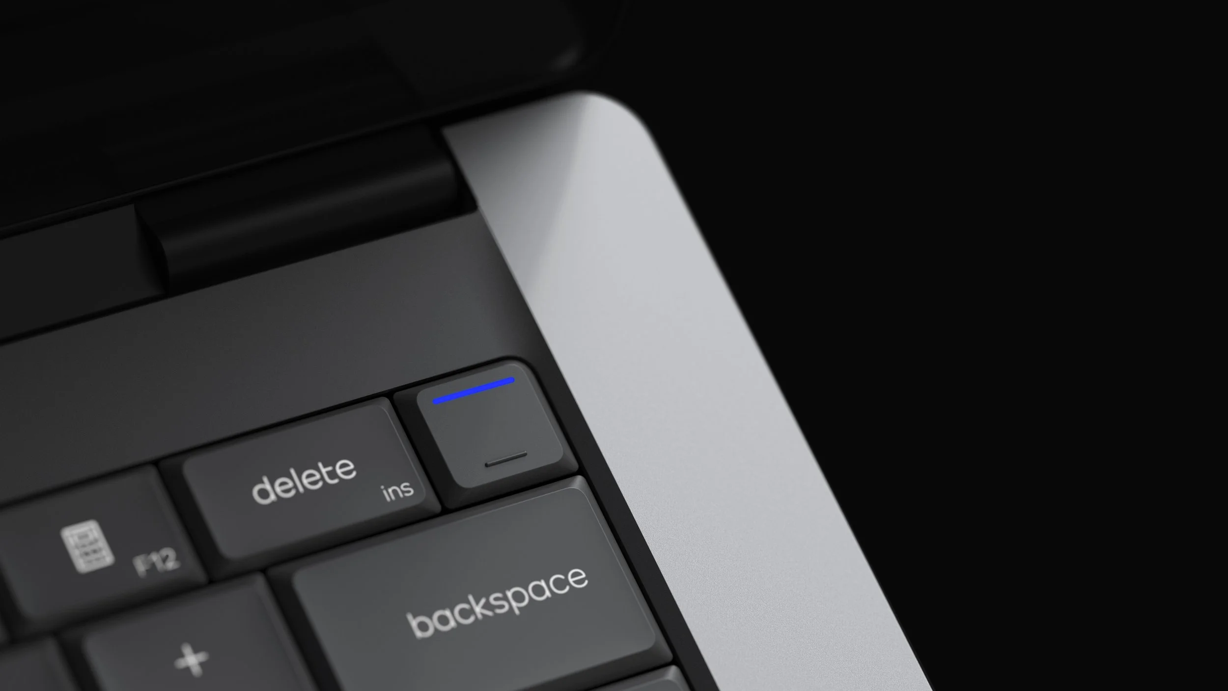
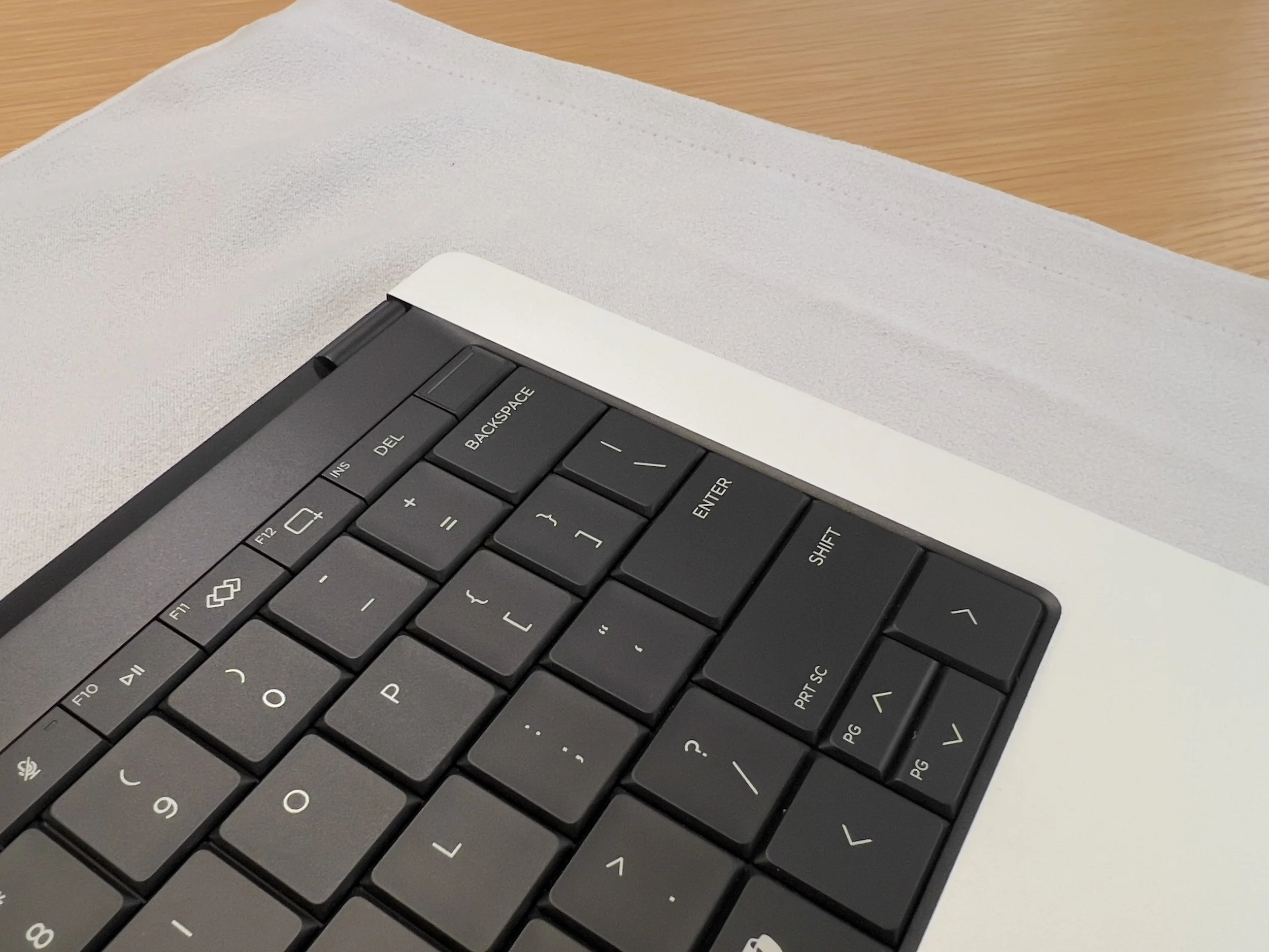
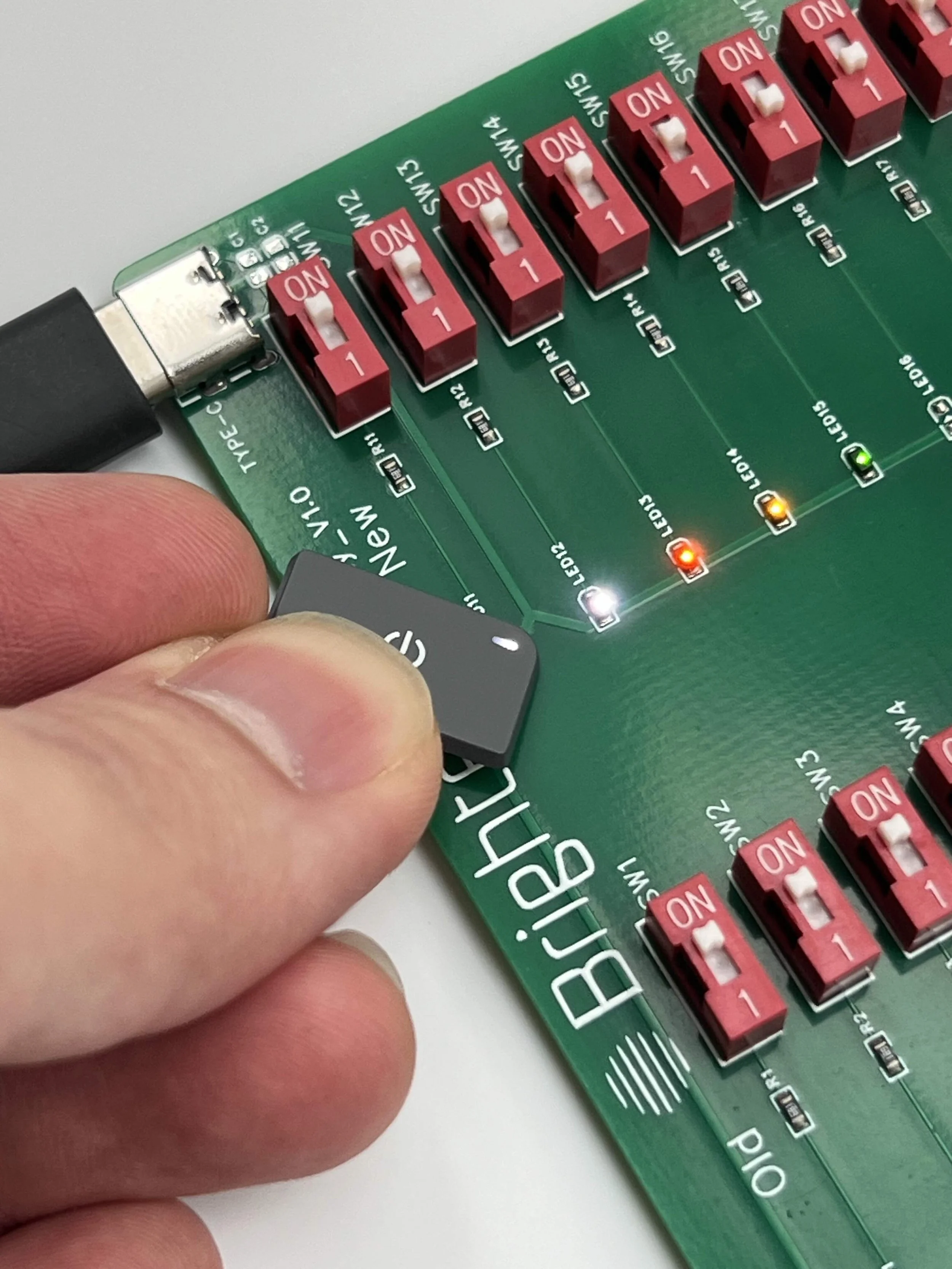
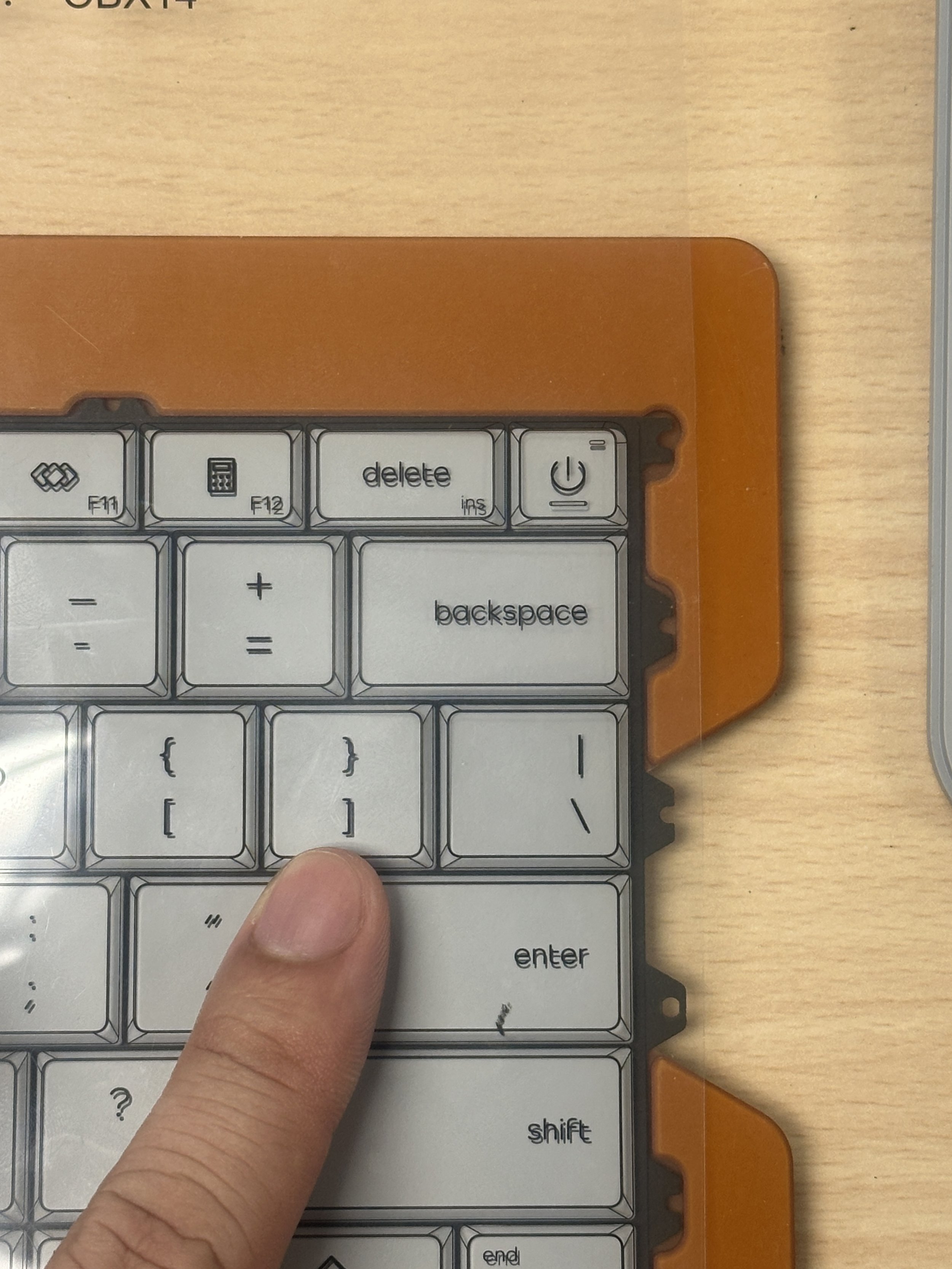
Small details, such as LED indicators, are utilized to create iconic user moments. The pill-shaped indicator, paired with signature HP Blue lighting, strengthens HP’s visual identity and leaves a lasting impression.
The scalable design also embodies in the smallest element such as power LED indicator. The pill-shaped LED is scaled into a full bar to show a fingerprint sensor is embedded , serving as a bold, intuitive signifier for the user.